 Students Incorporated
Creativity
Why Corporate Rebrands Keep Failing the Same Way
A Bangkok student podcast's segment on famous design fails, taped in 2024, ended up previewing the Jaguar and Cracker Barrel rebrand disasters that followed.
Good design usually fails for the same reason twice. When Jaguar unveiled a rebrand in November 2024 that dropped its growler-cat emblem for a minimalist wordmark and an ad with no cars in it, and when Cracker Barrel tried something similar in August 2025 by swapping its "Uncle Herschel" barrel silhouette for a plain gold wordmark, both companies triggered the exact backlash pattern that two Bangkok high schoolers had already diagrammed on a podcast, using a case study from 2009.
That case study, and the lesson underneath it, is the real substance of a recent episode of Students Incorporated, the student-produced podcast out of the International Community School of Bangkok (ICS Bangkok). Hosted by Mr. Jason with student designers Micah and Esther, then joined by Mr. Darwin, the school's in-house multimedia designer, the episode set out to teach design fundamentals to non-designers. What it actually captured, without meaning to, was a preview of two of the biggest corporate design blowups of the following two years.
The Segment That Named the Pattern First
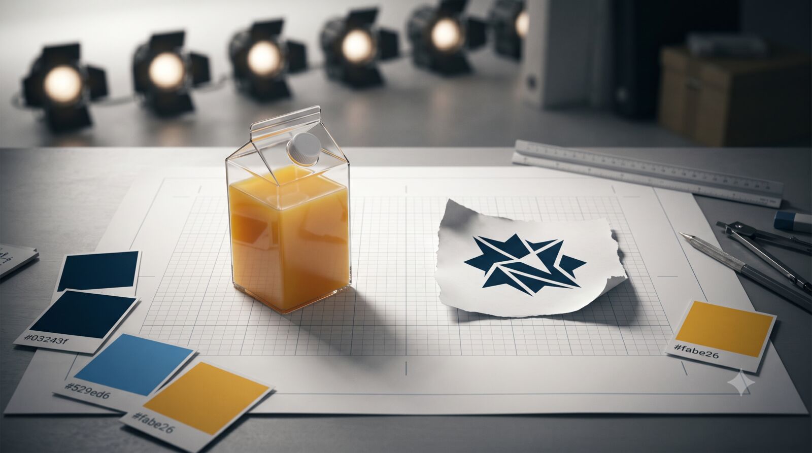
Early in the episode, Micah and Esther ran through what they called "not so funny design news," a rundown of famous redesign disasters. The first was Tropicana's 2009 packaging overhaul, in which the company replaced its familiar image of a straw stuck into an orange with a plain glass of juice and a new logo. "Sales reportedly dropped by 20% in just a few months," Esther explained, "and Tropicana ultimately reverted to its original packaging design after losing around $30 million." The number holds up: within two months of the January 2009 relaunch, Tropicana's sales had fallen 20%, a loss of roughly $30 million, per retrospectives from The Branding Journal and Packaging Digest, and the company brought back its original carton by March. Design firm Arnell Group had removed the exact visual cues, the orange, the straw, the familiar type, that let shoppers recognize the carton at a glance, and shoppers punished the change immediately.
The second case was the emblem designed for the 2012 London Olympics: an abstract, jagged rendering of the numerals "2012" that drew what Esther called "one of the worst logos in Olympic history." The design firm behind it, misidentified in the recording as "Wolf Oland," was actually Wolff Olins, which spent close to a year on the mark at a reported cost of £400,000. The backlash was severe enough that, per coverage from Design Week and It's Nice That, an online petition to scrap the logo gathered tens of thousands of signatures, medical experts flagged that an animated version could trigger seizures in people with photosensitive epilepsy, and a member of Parliament called for it to be axed. London's organizers kept the mark but pulled and re-edited the animated campaign around it.
Two New Case Studies Arrived Right on Schedule
Neither Micah nor Esther could have known it while recording, but the pattern they'd just described was about to repeat twice, in public, at a scale that made 2009 look quaint.
Jaguar's November 2024 rebrand replaced its long-running leaping-cat logo with a mostly lowercase wordmark and launched with a 32-second ad featuring no vehicles at all, just models in avant-garde clothing posed against pink geometric backdrops, as Forbes and other outlets reported. Elon Musk's since-viral question on X, "Do you sell cars?", drew more than 160,000 likes. A poll run by the German newspaper Bild found 93% of roughly 18,000 respondents called the new identity "creepy" and said it no longer felt connected to the brand. More than a year later, the production car meant to prove the new look, now named the Type 01, still hadn't been fully unveiled; as of mid-2026, prototypes were still appearing in public wearing camouflage wrap, leaving the rebrand to exist for months as branding without a product behind it.
Cracker Barrel's version played out even faster. As part of an August 2025 "All the More" rebrand, the chain replaced its old logo, featuring "Uncle Herschel" leaning against a barrel, with a stripped-down wordmark on a gold background, part of a broader push toward simplified, screen-friendly branding. Within a week, the company had lost close to $100 million in market value as backlash mounted, amplified by conservative commentators and a public post from President Trump, per Al Jazeera and Forbes. Cracker Barrel reversed the logo change on August 26 and by September 9 had cancelled the broader rebrand entirely, walking back a strategic overhaul in under three weeks.
Why the Same Mistake Keeps Getting Made
The ICS Bangkok episode's design-principles segment, delivered before the case studies, laid out the mechanism these four failures share. "A brand is important because those elements represent the identity of the business or company or organization that you're working with," Mr. Jason told listeners, walking through best practices he and Mr. Darwin had compiled. Consistent logos, fonts, and colors aren't decoration in that framing; they're the accumulated visual memory a company has built with its customers, and stripping them out resets that memory to zero.
Mr. Darwin, introduced as the person responsible for most of the posters and signs students see around campus, spent the second segment walking through design "no-nos" that make a project look unprofessional: overcrowding a layout, ignoring alignment and spacing, choosing fonts that clash with a document's purpose, and skipping user testing. "Overcrowding with too many elements, whether it's your image, fonts and colors," he said, "creates visual chaos and confuses the audience. You are designing to communicate or to inform." That last mistake, skipping the step where real people react to a design before it ships, is arguably the one Jaguar and Cracker Barrel share most directly with Tropicana and Wolff Olins: all four rebrands were built and approved inside a closed room, then released to a public whose reaction had never been tested.
A brand is important because those elements represent the identity of the business or company or organization that you're working with.
Design researchers have formalized this idea for years under the banner of brand equity, the theory that a logo, color palette, and typography accumulate real financial value the longer they stay consistent, value a redesign can erase overnight if it discards too much at once. Marketing retrospectives on both the Tropicana and Jaguar episodes point to the same root cause Mr. Darwin named on air: designers chasing a more "modern" look prioritized the object over the person meant to recognize it. Cracker Barrel's own executives seemed to concede as much when they reversed course inside three weeks rather than defending the new identity the way London's Olympic organizers, working before rebrands could be litigated on social media within hours, ultimately did.
The Advice That Would Have Saved Everyone Money
None of the ten best practices Mr. Jason and Mr. Darwin ran through late in the episode are exotic. Keep a design simple. Use a grid. Limit a palette to two or three primary colors. Stick to one or two readable fonts. Test the result on real people before it ships, a step Mr. Darwin suggested doing informally: "If you don't have the luxury of owning multiple devices, send it to your friends who have different types of devices and ask for their opinion on how it looks." Mr. Jason's response doubled as the episode's most quietly accurate line: "Usually your friends will be honest with you."
That's a cheaper research method than anything Jaguar or Cracker Barrel's agencies ran, and by the record of the last two years, it might have caught the same problem. Both companies had the budgets to test new identities on thousands of real customers before a launch date; what they lacked, on the evidence of how fast each retreat came, was a mechanism forcing anyone in the room to ask the question a Bangkok classroom asks by default: does this still look like us to the person who has to recognize it on a shelf, a storefront, or a hood ornament?